Cre8tiveBuilds Logo and Visual Identity Design
My S.H.A.P.E design process led me to create this logo and visual identity. It is impossible for me to begin designing without asking a lot of questions. That's why the Search (S) Phase from the S.H.A.P.E design process is the first step in creating a customer-focused logo design.








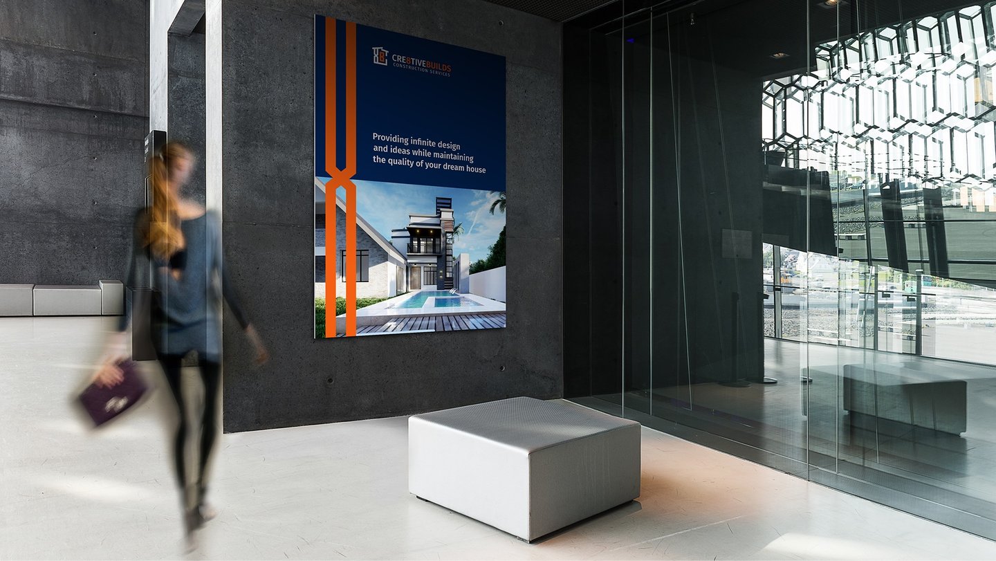

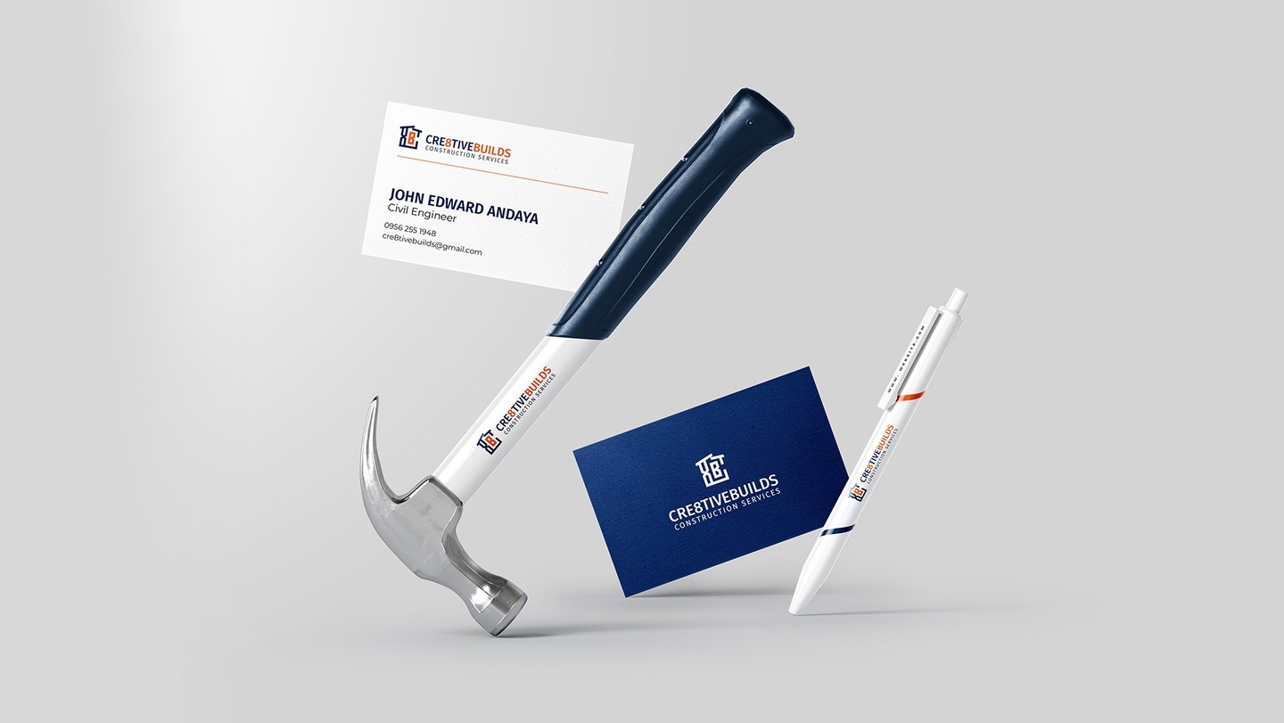

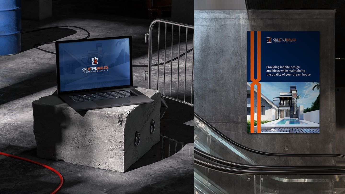

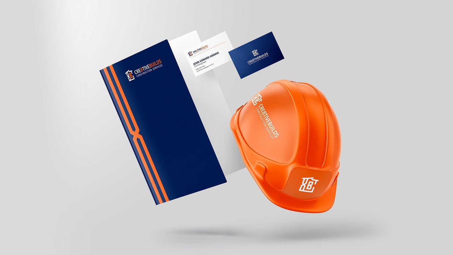
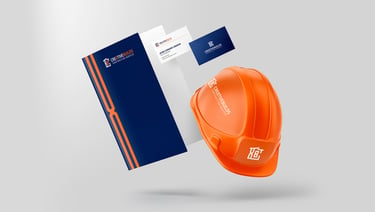
If you are looking for a logo and visual identity that is customer-focused, you can work with me through my S.H.A.P.E design process.
Black and white is the best color to start with when designing a logo because it focuses our attention on the shapes. Black and white are the simplest colors to work with, and they have no distractions. They also create a strong contrast between the shapes, which makes it easier to identify them.
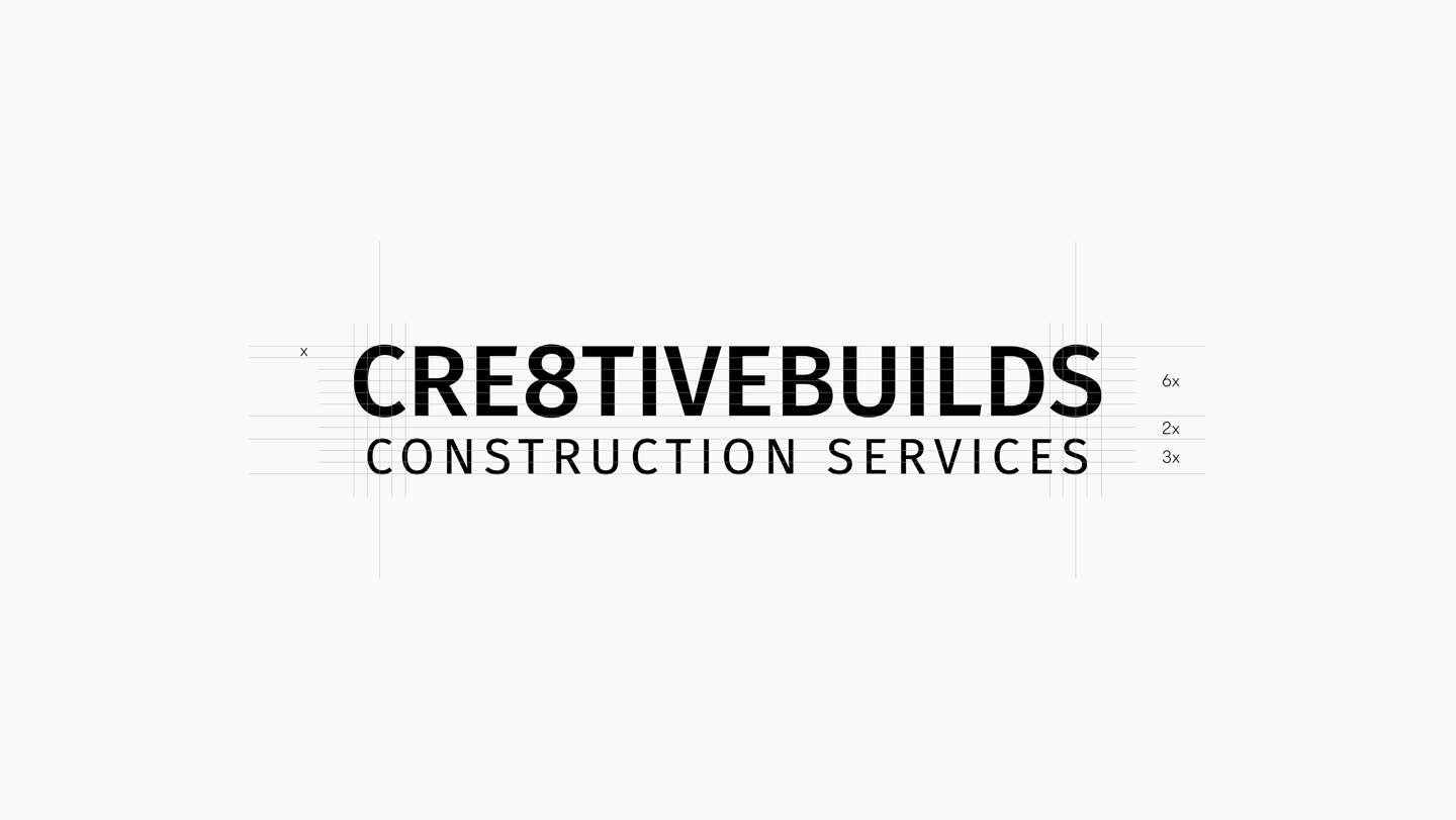
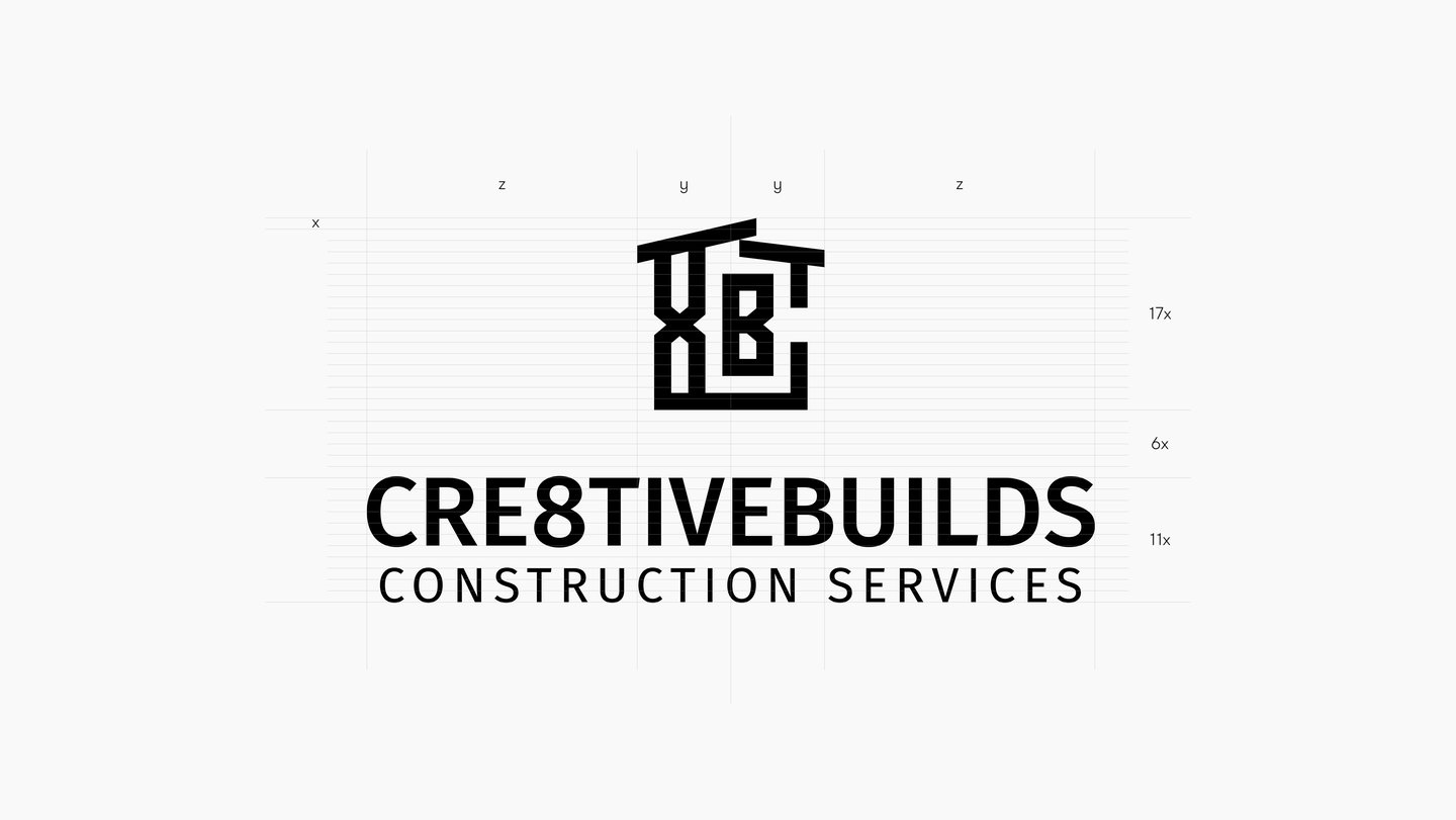
It is important to balance the brand name's first and second lines.
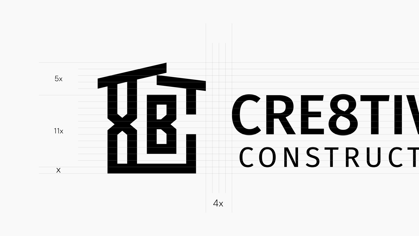
Using an appropriate spacing and balancing logomark and logotype will result in a visually appealing logo.
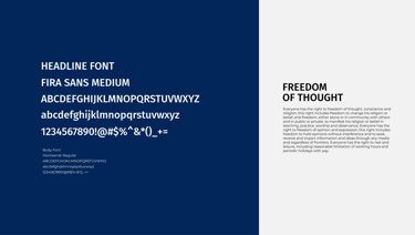
In logo design, we must consider whether to use the font in headlines or body text to create a cohesive visual identity.
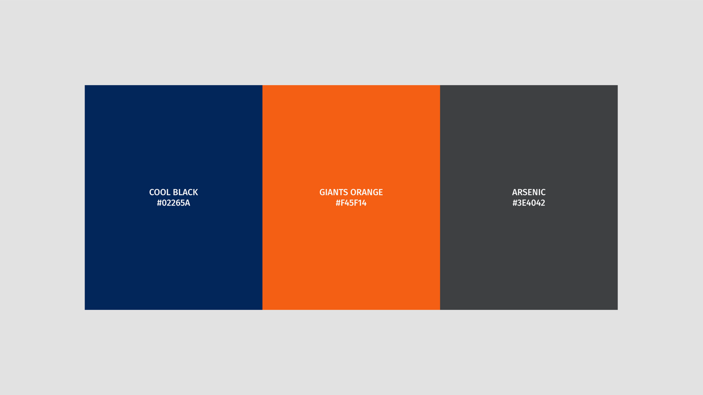
Color is part of a visual identity. It can evoke emotions, set the mood, and create an impression on customers. Color can also be used to differentiate a brand from its competitors. Color is one of the first things customers see, and it can be a powerful marketing tool.
It can be used to create a consistent look and feel for your brand, as well as to make your brand stand out from its competitors.
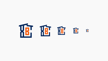
The logo design must be recognizable even at a small scale. It should stand out and be easy to remember. It should also be versatile and able to work across different mediums. The logo should be simple and eye-catching, so it doesn't get lost when scaled down.
It should also be timeless, so that it won't become outdated in a few years. Finally, it should be versatile enough to be used in a variety of contexts and on different media.
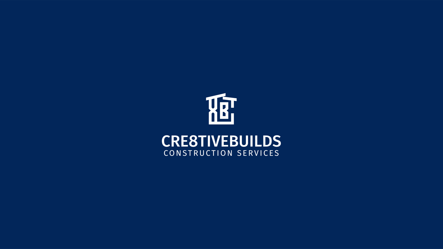
This is the horizontal version of the logo, which can be used on websites and other collateral.
Balancing the vertical logo design version. The vertical version can be used for design collateral in portrait orientation.
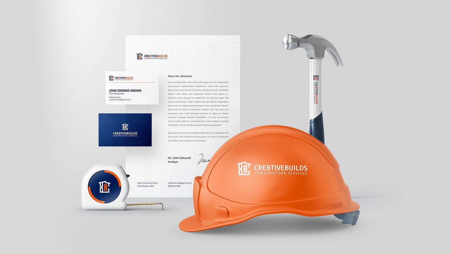
Presentation is the fourth phase. A mockup presentation was used to present the logo design to the client. A mockup presentation was used to create a realistic visual representation of the logo design. This allowed the client to see how the logo would look in real life and gave them the opportunity to provide feedback.
Engaging the client is the fifth and last phase. The logo design needs to be created in collaboration with the client. In order to finalize the design, his feedback is needed. Finalization is followed by the preparation of logo files.
A search for or discovery of the brand can assist me in identifying the problem. This will allow me to tailor my approach and strategies accordingly. Furthermore, it will give me a better understanding of what the brand stands for and how I can contribute to its success.
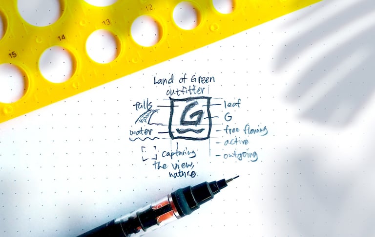
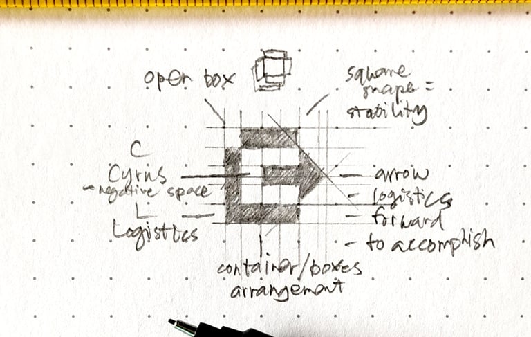
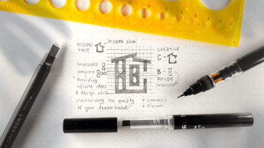
Following the Search Phase, I use my Hand (H) to sketch and vectorize. The Hand Phase allows me to quickly sketch ideas from different shapes. The sketch is based on the search process. From there, I can vectorize my sketch to create a digital version to use in the design process.
Analyzing is the third phase. Reflect on whether the design is effective, aesthetically pleasing, and functional. Evaluate the success of the design and consider ways to improve it. Make adjustments if necessary. Test the design to ensure that it is working as intended.
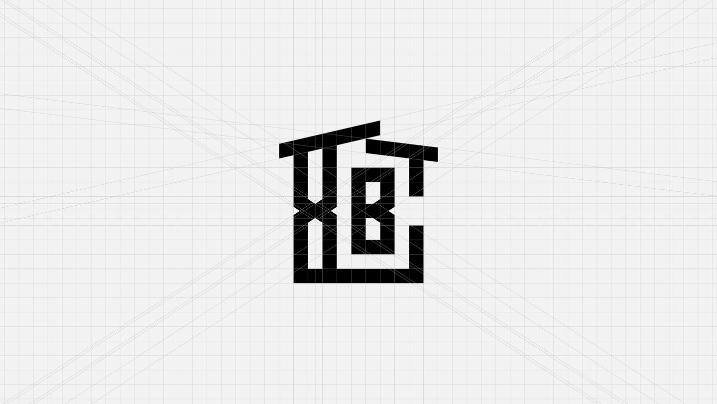
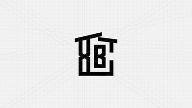
Using Adobe Illustrator, I created the logomark and logotype using a logo grid. The logo grid helped me to position and format the logo elements in a way that was aesthetically pleasing and harmonious. It also allowed me to ensure that the logo elements were consistent in size and spacing, and that the logomark and logotype were in harmony.
Other Featured Projects
Kesíngngo! Logo and Visual Identity Design
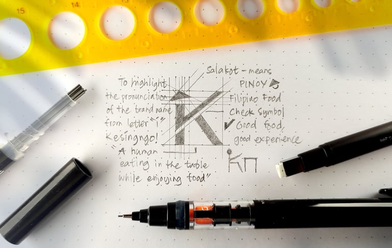
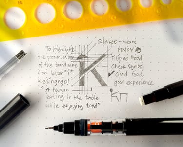
Kesíngngo!'s logomark is a combination of the letter "K", Filipino hat ("salakot"), and a long vowel letter "í". The letter K was inspired by the formation of a human eating food in the table. To match the brand's approachable yet premium personality, the font has been modified.
Land of Green Outfitter Logo and Visual Identity Design
The logo mark is composed of a waterfall, leaf, the letter G, and a camera lens. As you wear the Land of Green outfitter, you will be one with nature while capturing the view. The G is formed by a leaf and falls. Symbolizing all the elements of nature in one symbol.
